
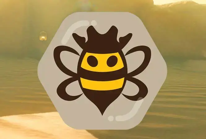
We hope this logo will look more friendly to people 💖
Thanks again to @UrLogicFails@beehaw.org for their great work!
Beehaw!
You must log in or register to comment.
The honeycomb theme on every icon is a pretty swell idea. Bravo.
Looks great!
Not sure why, but the previous one made me smile. When I think about it, I believe there’s two reasons why.
First, that the previous looked more like an actual insect. It clicked in my mind instantly as an insect and then I noticed all the cute details.
Second, I think the angle was different. After being stung from bees a lot, some of them on the face, this angle makes me feel that it’s about to land on me. The previous angle (if I remember correctly) made me feel like I was an observer of the insect going about it’s life, whether wasp or bee, no feeling of threat.
Not sure if I describe it properly, maybe just the usual old vs new and force of habit…
No I think you’re on to something
I get that it aligns the imagery more with the whole aesthetic but I can’t help but be bummed for the little outgoing bee rustler. I really liked her
Agreed. This logo’s all bee and no haw.
There will always be groups of people who prefer the old and new. With more cohesive branding with our community logos and eventually a lemmy theme, I’m hoping we can rotate logos semi-regularly as a way to represent the diversity of our website and to help support amazing local artists.
But that’s just my thoughts on it, in this case it was a logo commissioned for a specific purpose (app icon), and we wanted to align with that and celebrate new and great art (as well as continue to support the artist who’s helped us with all our community icons!)
I’m sure there’s a place where she could still work… like maybe the 404 page or the maintenance page?
We’ll look into places for this to exist
This feels like an answer for a trivia question years down the line.
“Fun fact, the 404 page bee is actually the old logo from way back in the day!”
There are a few examples that come to mind of rotating brand elements, both large and small, that make me think there’s a lot of potential to give a place and community some flavor and fun. I get the vibe you’re already on board with this kind of thing, but for the sake of putting it on record and giving everyone else a sense of what’s possible, I think it’d be cool to give a sense of the kind of things we can do in the future. Admittedly I’m 99% sure that these ideas are impractical, if not impossible, with Lemmy’s current UI abilities. Still, I think it may be good for the community to keep stuff like this in the backburner in case the potential opens up. This is spit balling, admittedly. Hopefully spit balling we’ll be able to act on eventually, though.
-
I remember Apollo for Reddit had a massive library of app icons that users could independently choose from. There was what I would call the primary mark and a few color or smaller derivatives of that, but there were also some wildly different ideas that were loosely tied to one another. Some were closely aligned with the original Apollo, others were barely connected to that visual identity. Either way, Chris got a lot of artists involved in the app icons aspect to Apollo. I forgot if they were commissioned or if it was some part of a community volunteering bit, but it was a cool way to add another touch of customizing and involvement to the app.
Newgrounds is an example that I think goes even farther than Apollo. There are visual elements that remain consistent, like the logo, logotype, and site iconography. But every so often (IIRC, something like once a month or once a season,) they’ll bring in a community member to change up most of the site’s color scheme and the site’s padding graphics. I can’t seem to get the Wayback Machine to load a good capture on my end, so I went ahead and took a screenshot for archrival’s sake.
-
I’m leaning toward saying that the new logo is an improvement, design wise. Digital icons, let alone content like tab icons, will always require some sacrifices in detail in order to be legible. This logo still has some legibility loss in smaller sizes (although I’ll admit asking for that not to happen is a mighty tall order,) but I’m tempted to argue that it maintains its legibility better than the Bee Rustler. Mentioning visual unity with the community icons series is something I’d say is a plus, but if seasonal or community variants to the site logo is something that’s explored later, it makes that point not quite as meaningful.
Bee Rustler was a cute lil’ thing and I loved her as much as anyone else, but admittedly I’m not so sure her graphic was a good fit for a logo. Chances are, however, that this is the kind of thing that would be most completely resolved with a comprehensive brand set that can accommodate community flavoring in aspects of it when the time comes. I’d think that’s getting well into long-term territory, however.
Issues aside with Bee Rustler being a catch-all logo solution, I doubt that Bee Rustler is going away entirely any time soon. Mascots, and more broadly the sense of characters within a community, have a way of maintaining staying power. There’s going to be means and ways for Bee Rustler to show herself and still be part of the community lore, whether that’s officially or through the user base. Like I’ve still gotta see the Bug Crusher through before I throw the towel, and I don’t think that’s gon’ be the end of it from me or anyone else either 🤠.
I doubt that Bee Rustler is going away entirely any time soon. Mascots
Has it been made into a plushie yet? Just asking 😁
(BTW, TIL bee rustling is an actual IRL crime)
I like the hexagon, matches the community icon shapes :) I’ll surely miss the old logo, but that might just be(e) my human nature of resistance to change
All these comments saying it’s no longer a cowboy - look at their little pointy cowboy hat ~!
I do love that you have a go-to artist you support here who has been doing great work on our site icons, but this one is a bit disappointing for me.
This logo looks a lot more aggressive, like it’s staring me down in anger and about to draw its pistols for a duel. There is no distinct head section, so the eyes look like predator-deterring fake eyes on its back. The eyes also look pointy and menacing in the tiny size it appears at the top of the page in my mobile browser. My brain interprets a sharp point reaching up from the apex of each eye to the hat due to the small gap between hat and eye. I see they are actually rounded off in the large version, but they don’t look round in tiny form which I am chalking up to an optical illusion at the working size. I also don’t like the lack of segmentation in the body.
The top of a cowboy hat is often a little bit narrower than where the crown meets the brim, the taper and dip make it easier to grasp the stiff top of it to take it off and put it on with one hand instead of having to grab it awkwardly by the wide brim. The really wide split at the top means that bee needs some giant hands to grab its hat. I also don’t understand the purpose of the extra bulk on the rim.
The thin connection point of the wings and lack of any filler color makes it look like an atom symbol floating behind the bee instead of a part of its body.
The old logo did look more like a wasp and the face was a weirdly fleshy color, but mainly it just needed a rounder bottom to soften it up. The wings were clearly wings, the head was clearly a head, and the hat didn’t sort of look like a crown.
I hope there will be more iteration on this logo and look forward to seeing what comes up next. Someone shared a version with a very mustache looking stripe on it and I loved that little detail.
This might be just me, but my first impression was the new logo felt more “aggressive”… like the bee is more confrontational by looking you straight into the eye and being ready to attack.
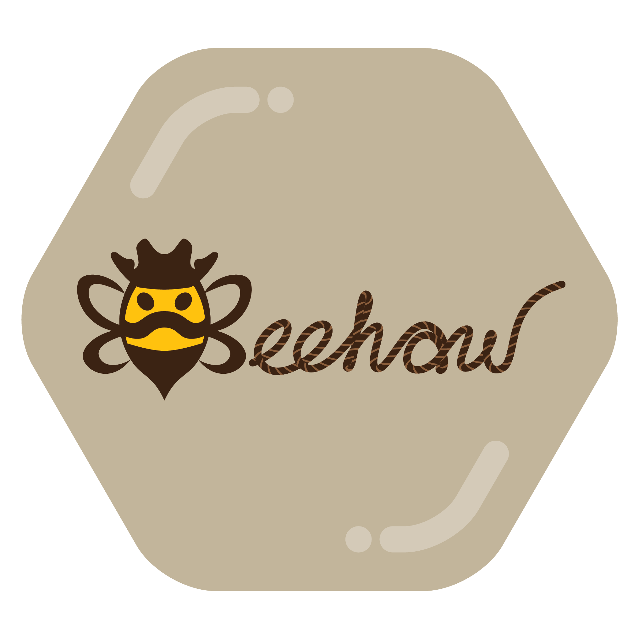
I think I like more the one on @UrLogicFails@beehaw.org profile banner:
 …with the moustache making it more cartoonish, and less “oh f*ck, a bee is trying to sting me!”.
But again, this is just my personal impression, and some possible bee fobia.
To me, the moustache reads like a frown, making this bee read as more aggressive.
I like the old one AND I like the new one. I will like all cartoon bee variations provided. Half the reason I joined this instance was for the bee pun.
I often joke that certain songs should have been in the bee movie soundtrack, but now I think I’m going to make that playlist for Beehaw.
Be(e) the change you want to see.
It has be(e)gun https://beehaw.org/post/1774728
I love it!
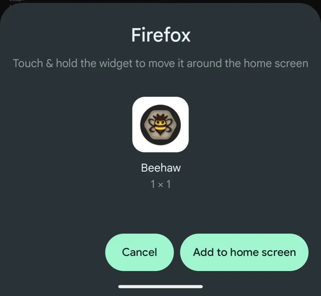
For some reason with the updated logo it seems the PWA’s icon is now missing. 🤔 (Chrome Android)
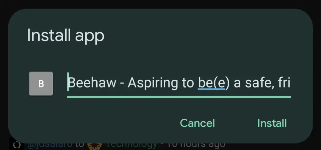
What browser and operating system is that on? Apple, safari? Android, firefox? Something else?
This was on Android Chrome but it seems have been resolved. 🤷♂️
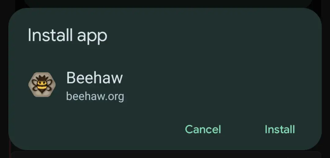
Also checked Android Firefox. All good there as well.


