- cross-posted to:
- canada@lemmy.ca
- cross-posted to:
- canada@lemmy.ca
the first public look at the Canvas rewrite
The event is happening in roughly 4 days from now 🎨
🔗 You can now create template URLs to figure out where you want your group’s template to go (settings -> template) make sure the switch is on, then you can copy the URL of the website
🌎 https://canvas.fediverse.events 🖌 Palette: Pxls 13
🔽 Post your group details w/ your template link below so people can find and join your group! (Template link, Matrix, Discord, Lemmy Community, etc) 🤝
Was scrolling though some older posts from last year, and came across @the_dopamine_fiend@toast.ooo’s idea to do the Arecibo message. So, here it is! Centered on the right edge because why not?
Thanks! I’m glad to see others excited about this.
Programming.Dev
Im going to be trying to set up a tech corner similar to what Programming.Dev did last year with the dark theme zone. Any groups who want to join on around the area feel free to reach out and we can do stuff like merge templates
I don’t have a plan yet, but maybe something right to repair near there would work?
No C++ :(
Cant fit all the communities so did mostly did ones I can make smaller. If theres more strength in terms of pixel placing that I know can contribute the area can be expanded but dont want to plan out more space than we can hold
Update: the template now has c++ along with a bunch of other communities
Here’s our current plan at lemmy.nz: https://canvas.fediverse.events/#x=162&y=344&zoom=18&tu=https%3A%2F%2Flemmy.nz%2Fpictrs%2Fimage%2F497358ad-b655-4ae1-9e42-ea70c303a63e.png&tw=112&tx=100&ty=300
Looks like we might be a bit more ambitious than others 😆. We had good participation last time though.
Edit: Updated to remove white background and convert to new colour palette.
You’ll want to make the background transparent for any pixels you don’t actually want to make sure are white.
Ah, right, thanks!
The aussie flag is even bigger than your plan. hopefully we get it finished this time.
Word on the street is no alts allowed this time. Last time we finished up our NZ stuff and tried to help you guys out, but without alts progress will be a lot slower!
Yep, no alts are allowed this year. Also, the Aussie flag is ⅔ the width of last time, so it should be a bit faster.
A lot less space and potentially a lot more participants! Will be interesting to see if you need to defend it! The brits might come in and steal it for themselves 😆
The Brits will definitly finish the union Jack for us :) . Hopefully they help with the rest of the flag. I doubt we will have to defend much, and I’m fine with small stuff on the flag like the fuck sped last year, as long as they aren’t over the stars and are decently small.
It will be interesting to see what the participation level is like. There are a lot less people on Lemmy than last year, but with the whole Fediverse able to participate this year we might get a lot of people joining. With the smaller canvas, I hope we don’t have to defend as it makes it less fun, but time will tell.
toast.ooo Logo 🍞
(Ategon redrew it to fit the palette better) 🍞❤
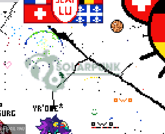
Solarpunk logo for !solarpunk@slrpnk.net
How does one create a shareable template? Do we upload a picture somewhere on the site? What format is required?
On the website click on Settings then put an image URL in the field (png preferably as it has transparency, but jpeg does work), then copy the URL of the website
it should add it to the end of the url
Thanks! Seems pretty nifty. Cool how any embeddable image can be overlaid at an arbitrary location on the canvas, rescaled to any size, and shared with a link. Well done!
Is there any way to load multiple templates at once to see if/how they overlap?
there is not unfortunately, only one template can be loaded at once
No worries! You’ve already done more than is expected!
My Little Pony
Template Link: https://lemmy.brony.place/canvas
Discord: https://discord.gg/bronyplace
Template flipped to avoid conflict with osu!
Damn, Nightmare Moon vs Daybreaker? That’s gonna be epic!
trying to make a rickroll qr code with https://i.imgur.com/zJfidzO.png at 53,141 no groups or communities because it’s just something stupid
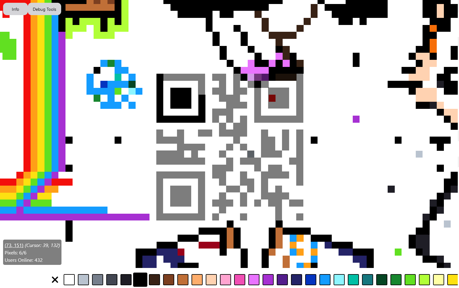
Just realised I can paste a link with the template already set up https://canvas.fediverse.events/#x=64&y=154&zoom=18&tu=https%3A%2F%2Fi.imgur.com%2FzJfidzO.png&tw=21&tx=53&ty=141&ts=ONE_TO_ONE
That’s very honorable pursuit. I’m myself stuck defending our flag, but I wish you best of luck!
I’m making a small Portal logo if someone wants to join https://canvas.fediverse.events/#x=550&y=219&zoom=8&tu=https%3A%2F%2Fi.imgur.com%2Fw5emPTI.png&tw=25&tx=501&ty=206&ts=DOTTED_BIG
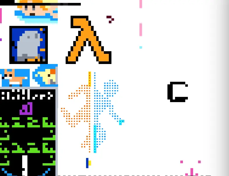
Edit: We now have a proper template here

Here is the template on the canvas.
https://canvas.fediverse.events/#x=472&y=73&zoom=9&tu=https%3A%2F%2Flemmy.ca%2Fpictrs%2Fimage%2F165e6e23-1abc-4719-9e41-b8e3ce743c7f.png&tw=64&tx=431&ty=41&ts=ONE_TO_ONE~~I made a template for Canada, happy to make edits :) ~~ ~~https://canvas.fediverse.events/#x=227&y=-172&zoom=7&tu=https%3A%2F%2Flemmy.ca%2Fpictrs%2Fimage%2F61d79ee7-d6b0-42b6-9b5e-4d1c61984ad9.png&tw=96&tx=403&ty=45&ts=ONE_TO_ONE~~
Thanks! Looks like a good start! I notice that there are some dark red pixels at the edges of some regions. I suspect this is because the original source image has black gridlines overlaid. Also, some of the colours don’t match the available colour palette exactly. Would you consider tweaking the template?
If anyone wants to help, I am making an Enlightened Ingress logo
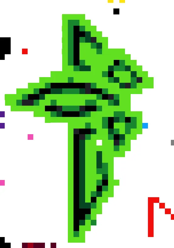
E: Template moved!
mrkazoo@masto.ai hey man, could you please move your art a bit ? You are currently drawing inside of the logo:/E: never mind, I didn’t notice you were already drawing something on top of the mastodon logo, sorry about that!
make it a bit smaller
It is considerably smaller than last year
Can someone reply to my comment in 2 hours?
no
Yo
Thank you
One Wizard lead cavelery, checking in!
Can you please respond back in two hours?
No.
I’m trying to paint the TF2 logo: https://canvas.fediverse.events/#x=-50&y=-203&zoom=9&tu=https%3A%2F%2Fupload.wikimedia.org%2Fwikipedia%2Fcommons%2Fthumb%2F4%2F48%2FTeam_Fortress_2_style_logo.svg%2F1024px-Team_Fortress_2_style_logo.svg.png&tw=25&tx=151&ty=43&ts=ONE_TO_ONE
Maybe someone else would like to help with that. I’m kinda struggling with picking the right colors, shouldn’t there be a way to automatically pick the right color for the template?
Edit: It’s done, now it only needs to be defended in case of vandalism :)

TF2 currently under attack by the aussies. I’m going to bed right now, so I can’t defend it.
Thanks for letting me now and your help!
So far no one out of the 8 templates I’ve seen are overlapping, nice.


